The Hartford · Enterprise · OOUX
Two divisions, one application — and more than either could do before
A cloud migration was the reason for the project. The redesign was the opportunity: combining two line-of-business applications into a single branded UI that gave agents and actuaries functionality neither system had offered.
The challenge
The Hartford was moving to a cloud-based server for the performance gains, and wanted to combine two of its major line-of-business divisions — Spectrum for Commercial and Personal Lines — into one application to make the most of those gains.
Consolidation on its own is infrastructure work. The design question was what the combined application should let people do. Each of the legacy applications supported agents and actuaries through hundreds of distinct daily jobs; rate quoting was a small slice of it. Merging them without expanding what they could do would have been a lateral move.
Research & discovery
Research ran through user surveys and a close reading of existing user feedback, and arrived first at a basic form-based MVP — nothing like the final redesign. Getting from there to something worth building meant working directly with product managers across six divisions, and with the engineers, to understand what each division actually needed and what the platform could support.
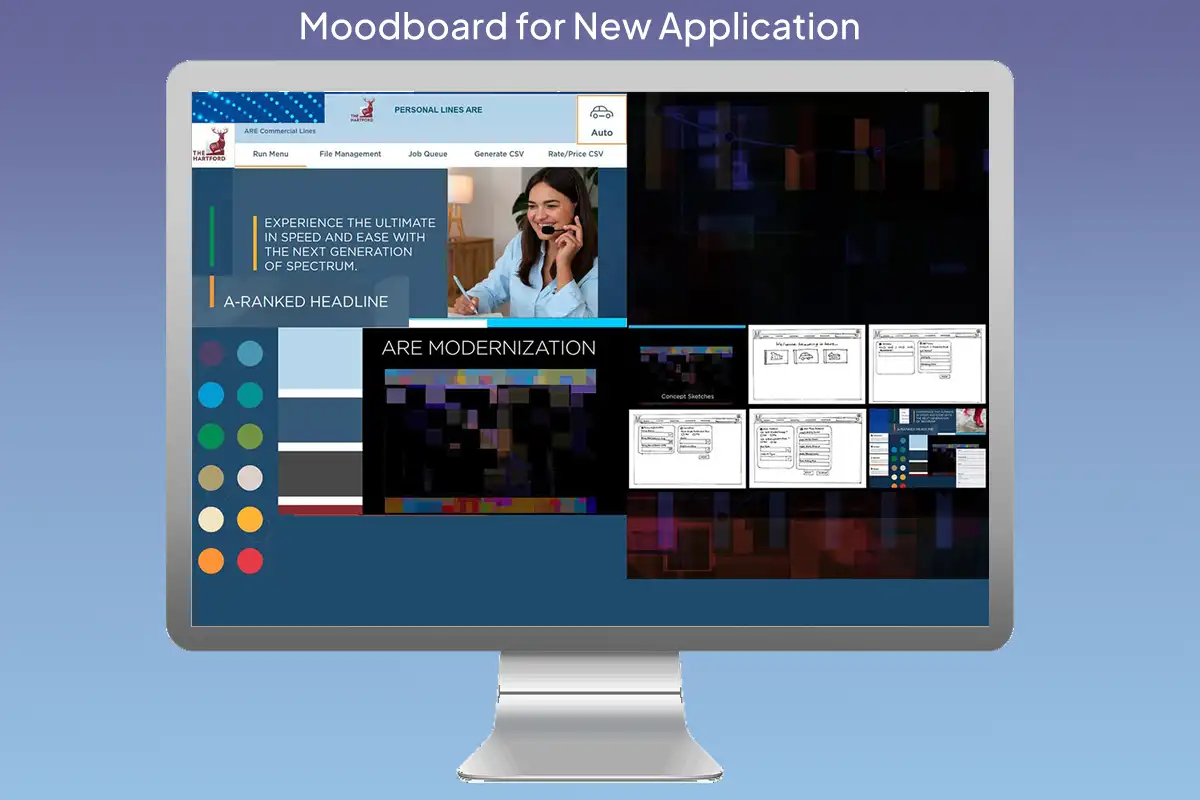
The redesigned landing page
The application opens on a responsive landing page with a personalized login and a header carrying the user’s name and division. It sets the pattern the rest of the product follows: one branded shell, adapting to who is looking at it and which division they work in.
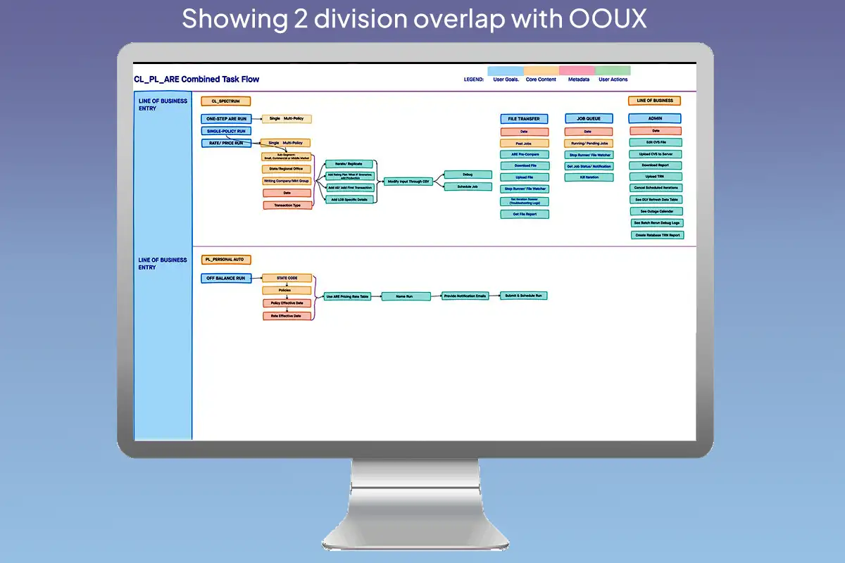
OOUX: mapping the overlap
Object-oriented UX gave a way to compare the two divisions structurally rather than screen by screen. Mapping objects, their content, their metadata and the actions available on them showed that roughly 68% of the task nodes across Commercial and Personal Lines were functionally identical — they differed in naming, not in underlying data or user intent.
That made the combined information architecture tractable, and it freed up the design work to go toward the parts that weren’t shared. The UI was built on the HUK component library, with a few components modified where the combined product needed behaviour the library didn’t cover.
What didn’t work, and what replaced it
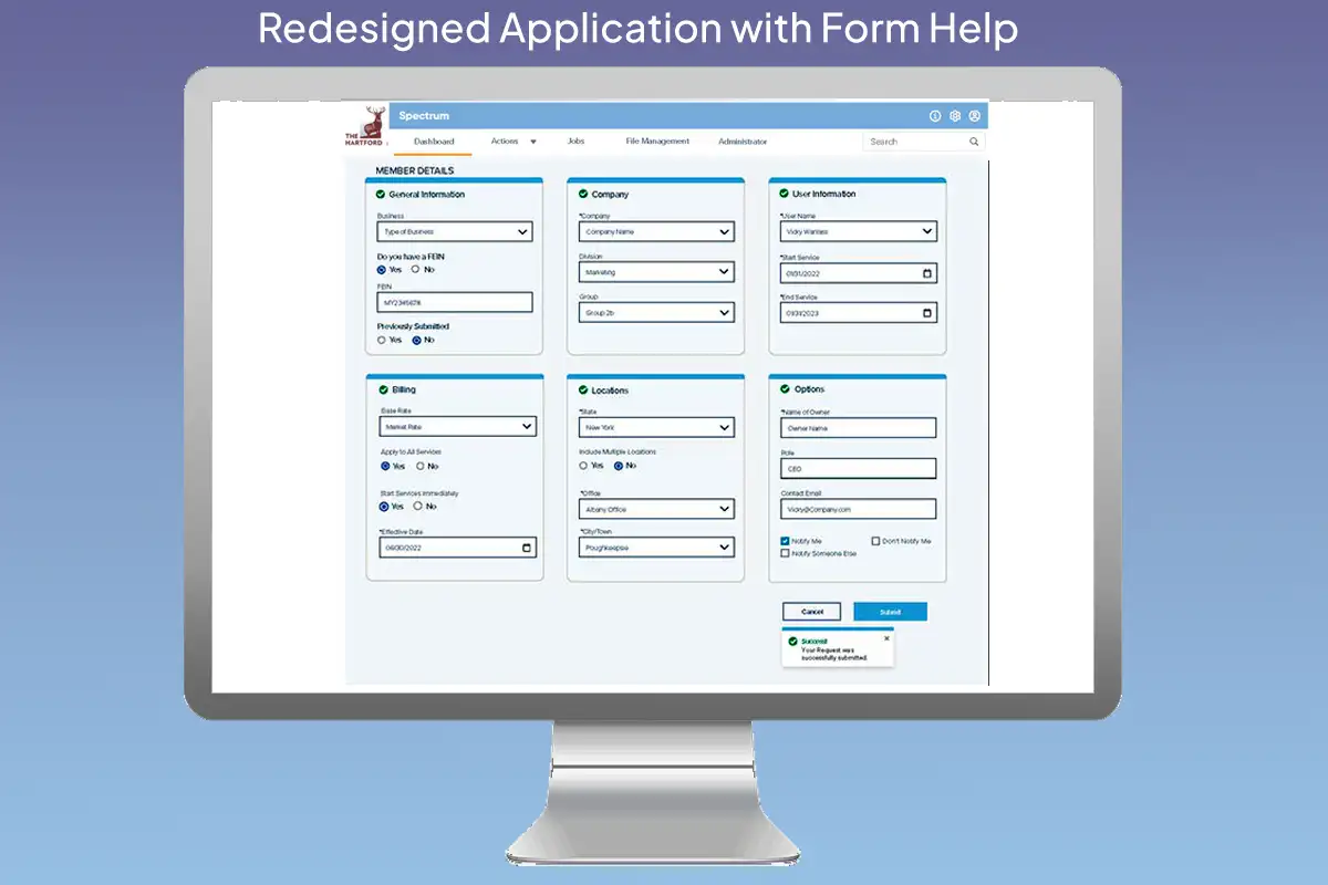
The form carried a long, detailed summary running alongside it, echoing every value as it was entered. It hogged space and earned little — agents already knew what they had just typed. It was replaced with a condensed stepper-summary at the right, which does work: it tracks position through the form without competing with it.
The form itself was redesigned in colour. Unfilled sections read orange; a section turns green with a check mark once it is correctly completed. An agent can tell at a glance which parts are done, which still need attention, and whether the whole thing can be submitted — without reading a word of it.
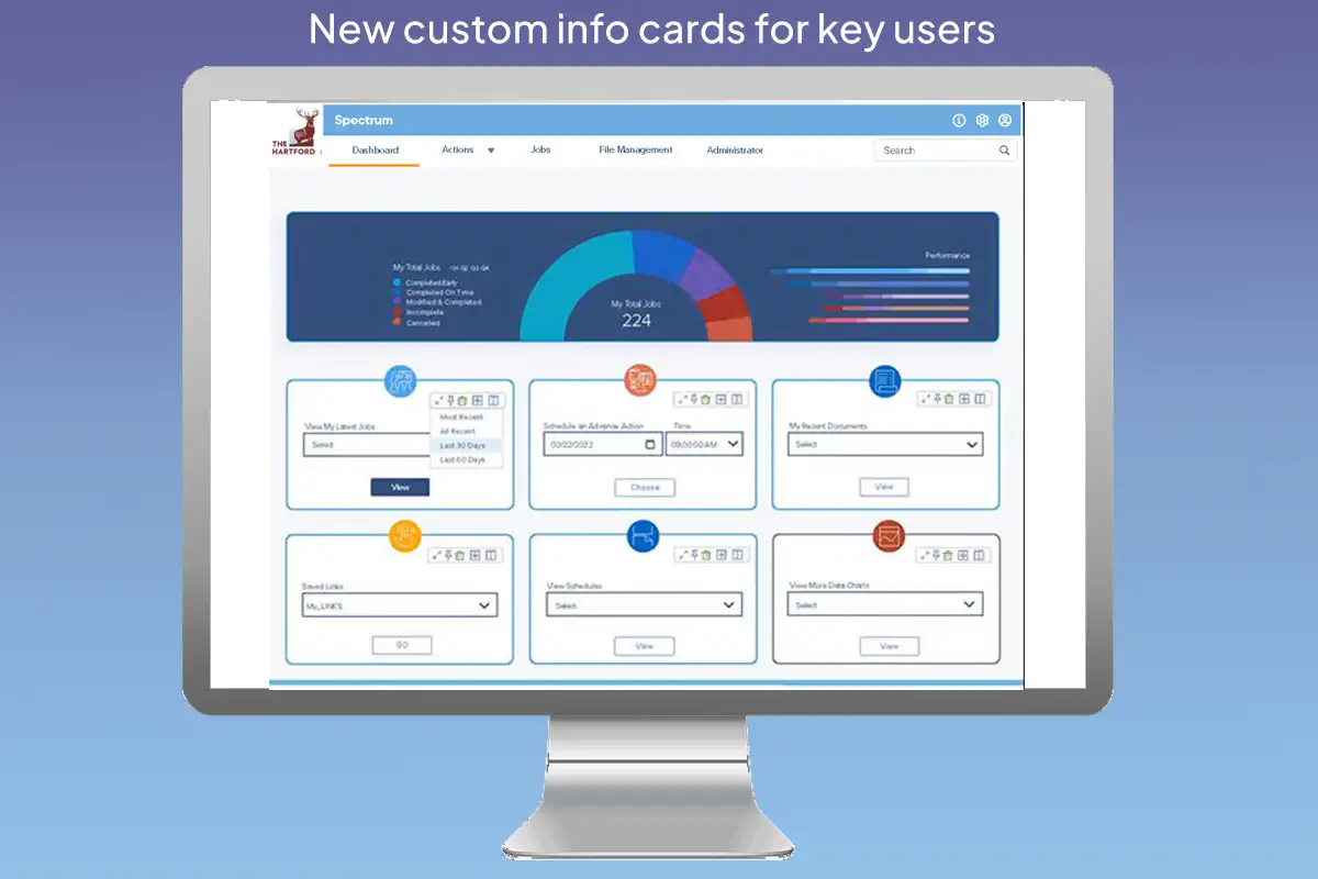
A card-based desktop
The redesigned landing page splits in two. The top third is fixed: full-width regional and personal overview statistics. The bottom two thirds is the agent's own — editable cards holding whatever they choose, with cards like the job queue and the data table able to expand and take over the whole lower region when someone needs to work in them.
The job queue: from “it failed” to “about twenty minutes”
The job queue is system-wide. It serves all six-plus divisions and handles many kinds of runs, and an agent's own jobs are a filtered view of it. That part already existed.
What it couldn't tell you was when anything would be ready. The info button on the jobs list gave very little beyond the fact of a failure — and a failure meant a complete redo. So an agent could see that a job existed and eventually see that it had died, but had no way to plan around either.
The redesign puts the queue on the agent's own desktop, filtered to their jobs, with a tracker that opens from the info button on any row and gives an approximate time to completion in minutes. It is deliberately approximate — hamburger-cooker accuracy, near enough to plan around, not a promise. Position in the queue was never worth showing; it tells an agent nothing they can act on. Roughly how many minutes until the work is back is the thing that changes their afternoon.
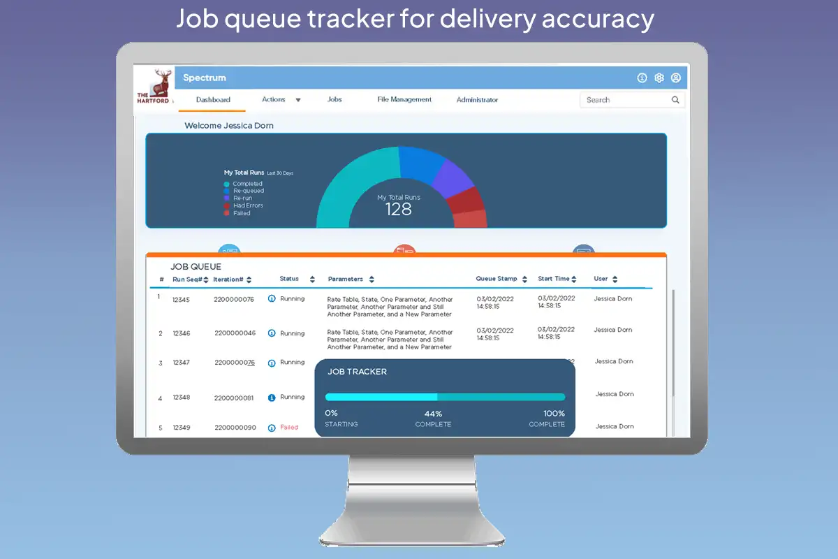

| # | Run Seq# | Division | Status | Submission | Submitted | Status detail |
|---|---|---|---|---|---|---|
| 1 | 12345 | Spectrum | Completed | Rate Table, NY, Multi-Policy | 08/20/2026 09:12 | Delivered 09:44 |
| 2 | 12346 | Personal | Running | Rate Table, CT, Single-Policy | 08/20/2026 09:28 | Est. ready ~10:05 |
| 3 | 12347 | Spectrum | Queued | Rate Table, MA, Multi-Policy | 08/20/2026 09:41 | Est. ~11:15 |
| 4 | 12348 | Spectrum | Queued | Rate Table, NJ, Commercial | 08/20/2026 10:05 | Est. ~11:40 |
| 5 | 12349 | Personal | Failed | Rate Table, PA, AARP Direct | 08/20/2026 10:22 | Failed 10:31 — see detail |
Select any run above to see where it stands.
Read-only. An agent sees where a run stands; running, re-running and cancelling happen elsewhere.
Click any row for its detail. Estimates are deliberately approximate — near enough to plan around, not a promise.
A known trade-off
The tracker shows one job at a time, so an agent watching four runs checks them one after another. Putting the panel below the table rather than over it means nothing gets covered while they compare, and the estimate for each run also sits in the last column of its own row — so the common question, roughly when will this be ready, is answered with no clicks at all. But the full detail is still one job at a time, and at higher job volumes that is the first thing I’d revisit.
Outcomes
- An MVP was built and tested with users, covering a subset of the new features
- Product managers from all six divisions supported the direction and helped refine it
- A sequential rollout began on the back of that work
- Agents can see approximately when a run will be ready, from their own desktop, instead of only learning after the fact that one had failed
Reflections
Both of the things I got wrong here were the same mistake: designing the container before understanding the work. The summary panel assumed agents needed to see their input reflected back; the generic landing page assumed one layout could serve six divisions. In both cases the fix came from the people who did the job every day describing what they actually wanted to reach for.
The timing estimate is the piece I'd defend hardest. It's a rough calculation, not a prediction engine, and it doesn't need to be more than that. Knowing a run is about twenty minutes out is enough to decide whether to wait for it or start something else — which is the whole decision an agent is trying to make.