Warner Media · SVODX · Global streaming delivery
Two hundred and forty-seven files, and no way to see which failures were the same failure
Redesigning the SVODX offerings dashboard — the system that tracks every programme file going out to every affiliate, in every format, and tells an operator what broke.
The challenge
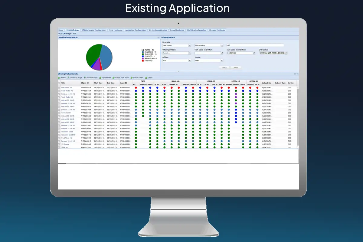
The existing SVODX real-time data visualisation dashboard was non-responsive, entirely non-intuitive, and without design, usability or branding — unsuitable for fast tracking of global resources. What was needed was a responsive application a medium-skilled operator could run: tracking programming, media packages and error fixing across every participating service.
What I did
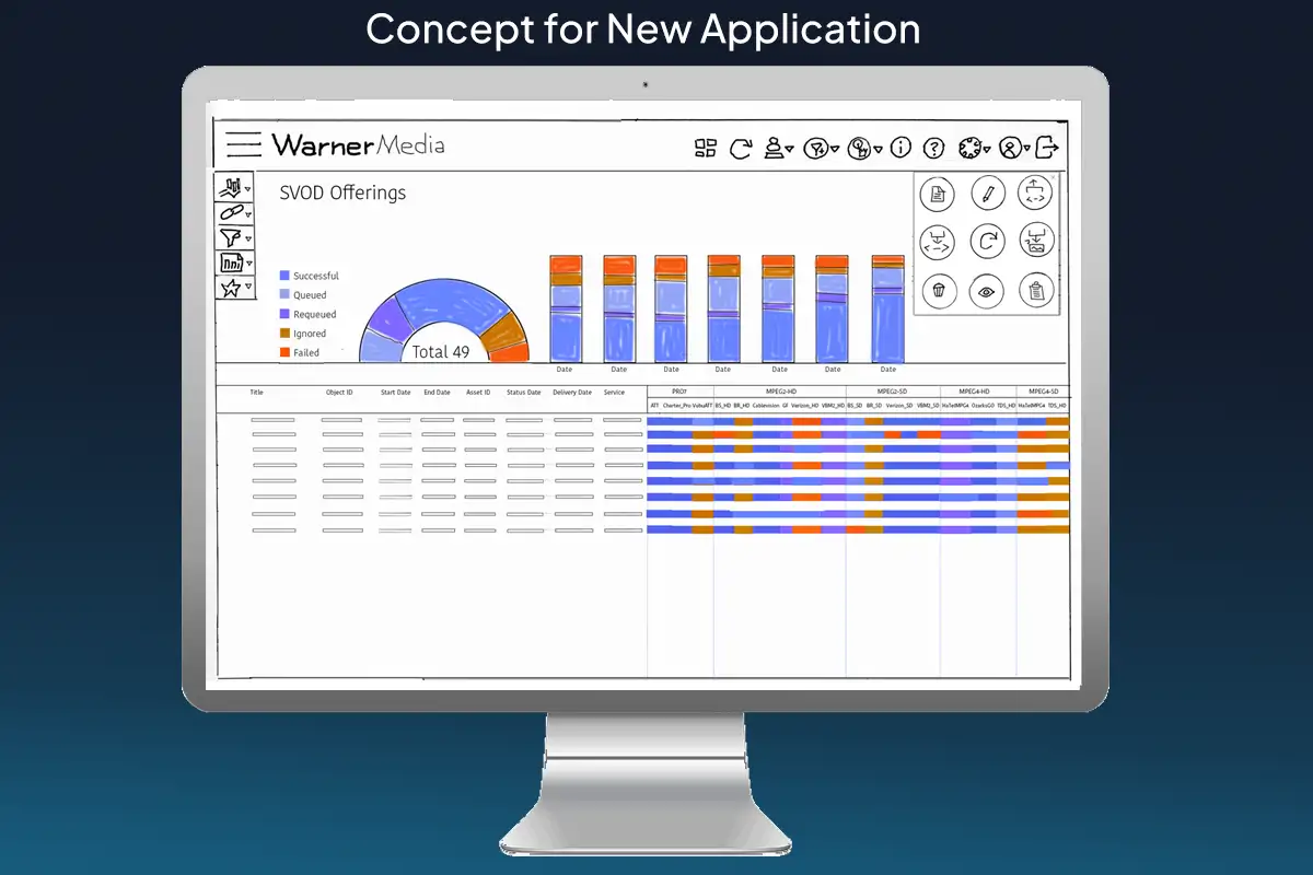
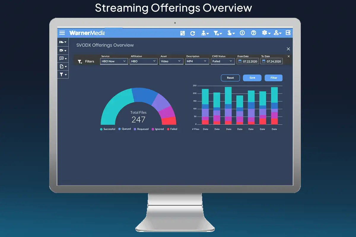
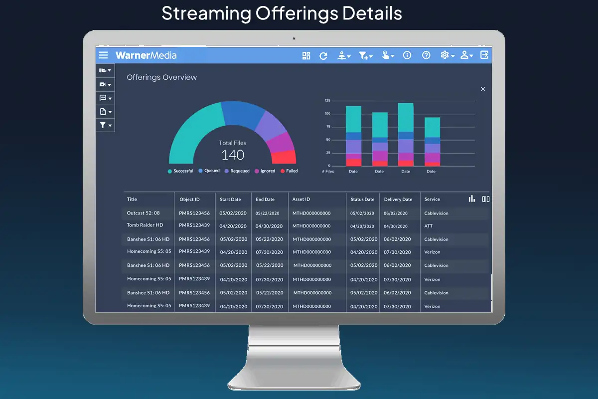
As principal product designer on a team of ten, I led discovery through user research and hands-on walk-throughs of the existing system. From there I sketched concepts, iterated with the team, and designed and prototyped an application built around admin users — clear interaction steps at every stage, instant data access, and built-in safeguards against the programming failures that had plagued the legacy tool. The data tables were rebuilt clean, branded and engineered for speed.
What came of it
The redesigned application was evaluated by the team and agreed to have greatly simplified the overview of global SVOD. A period of company reorganisation put it on hold — though a version of it was built later.
Reimagined: what the grid still can’t tell you
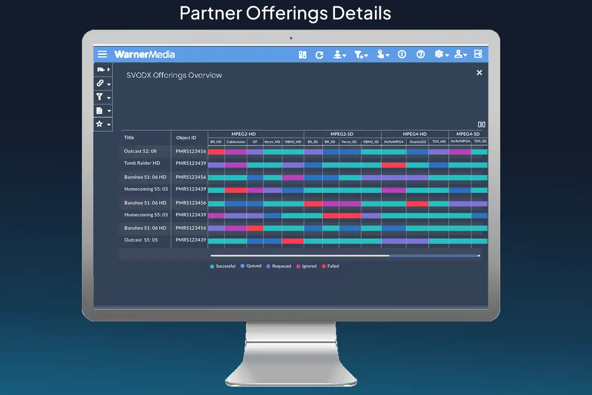
The partner offerings grid above is the strongest screen in the redesign. It puts every file, affiliate and format in one view and colours each one by delivery status, so an operator can see at a glance where things went wrong.
What it cannot do is say what went wrong. Nineteen red cells scattered across the grid look like nineteen problems. They are almost never nineteen problems. Usually one endpoint is rejecting a codec, or one source asset is short an audio track and failing to five affiliates at once. The operator’s real work is spotting that — and the grid, for all its clarity, leaves them to do it by eye.
So the concept below adds one thing: grouping. Failures are clustered by what they actually share — same endpoint, same source, same missing metadata field — each group carrying the evidence behind the grouping and a recommended action. Nothing requeues on its own. The system proposes; the operator confirms. Two failures that fit no pattern stay on the list as two failures, rather than being forced into a third.
Partner offerings — 120 files across 12 delivery targets
Each cell is one file going to one affiliate in one format. Red is a failed delivery.
Nineteen red cells look like nineteen problems. Grouped by what they share, they are mostly three.
Read-only until you confirm. Nothing is requeued without an operator action.
Open a pattern to light up only its files in the grid above. The scatter is the same data — the grouping is the point.
Reflections
I wished I could have overseen the build and helped create a model application for a better streaming experience for partners, programme operators and managers.
The clustering concept is the part I’d argue for hardest now. The original brief was to make the state of the system visible, and it did. But visibility is not the same as understanding, and an operator staring at a wall of red is still doing the diagnostic work unaided. Grouping the failures is a small change to the screen and a large change to the job.