UPS · Logistics · Consumer & Business UX
UPS Frequent User Rewards App
Designed a pro-rated cash-back rewards application for frequent and high-volume shippers, with fast category search for users, teams, companies, and custom groupings.
The Problem
UPS wanted to reward its most loyal and highest-volume shippers with a pro-rated cash-back program — a meaningful benefit that could strengthen retention and usage among the customers who mattered most to the business. But a rewards program is only valuable if users can actually understand it, navigate it, and trust that their benefits are accurate.
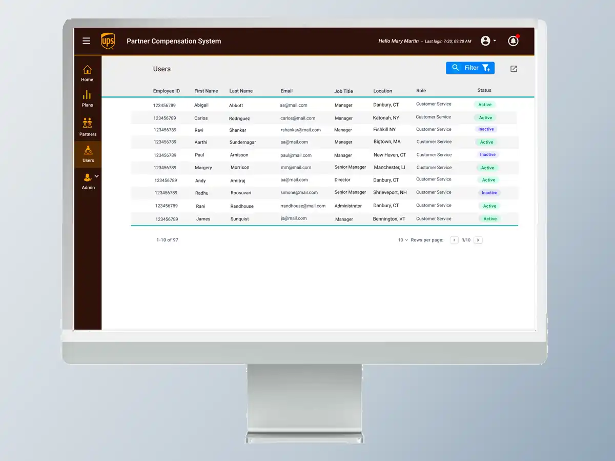
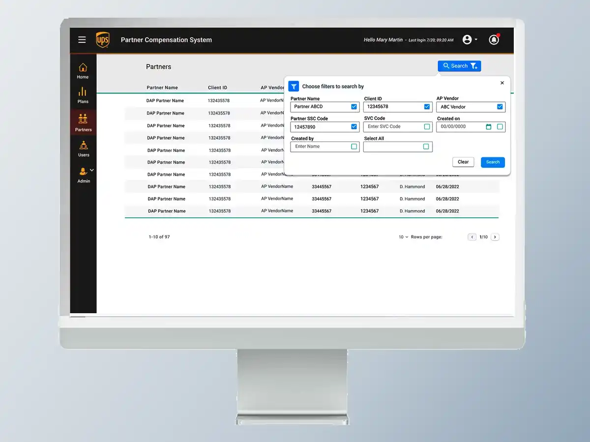
The design challenge was twofold: create an intuitive rewards tables interface that surfaced the right data to each user type, and build a fast, flexible category search that could slice statistics by users, companies, teams, and other groupings without requiring complex manual filtering.
My Role & Approach
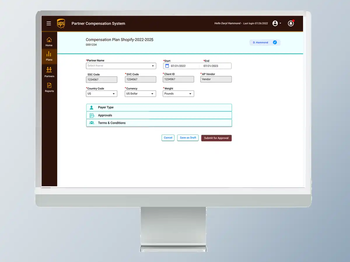
I led UX design for the entire rewards and volume application experience — from the rewards structure display to the category search and data table system. This project required balancing both consumer-facing clarity (individual shippers seeing their own benefits) with business-facing power (account managers and corporate customers viewing aggregate team and company data).
Two audiences, one design system: Individual users needed simplicity — "Here's what you've earned." Business accounts needed power — "Show me all teams in the Northeast by volume tier." The design had to serve both without feeling like two products stitched together.
- Mapped user types: individual shippers, team accounts, company accounts, and internal UPS account managers
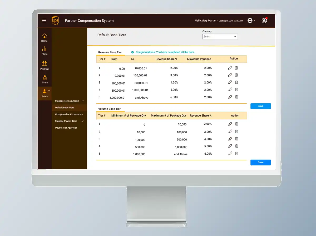
- Designed rewards tables showing pro-rated cash-back tiers clearly and transparently
- Built a category search UX allowing quick filtering by user, company, team, region, and volume tier
- Designed data views that scaled from a single user to large enterprise accounts
- Ensured all rewards data was presented in plain language — no jargon, no confusion
Design Highlights
Rewards tables: Clear, tiered tables showing exactly what percentage of cash back a user or account earns at each volume level — designed so a first-time user could understand the program without reading a FAQ.
Category search: A fast, keyword-driven search with category filtering allowed account managers to quickly find any user, team, or company and view their current standing, volume history, and rewards balance — no complex query building required.
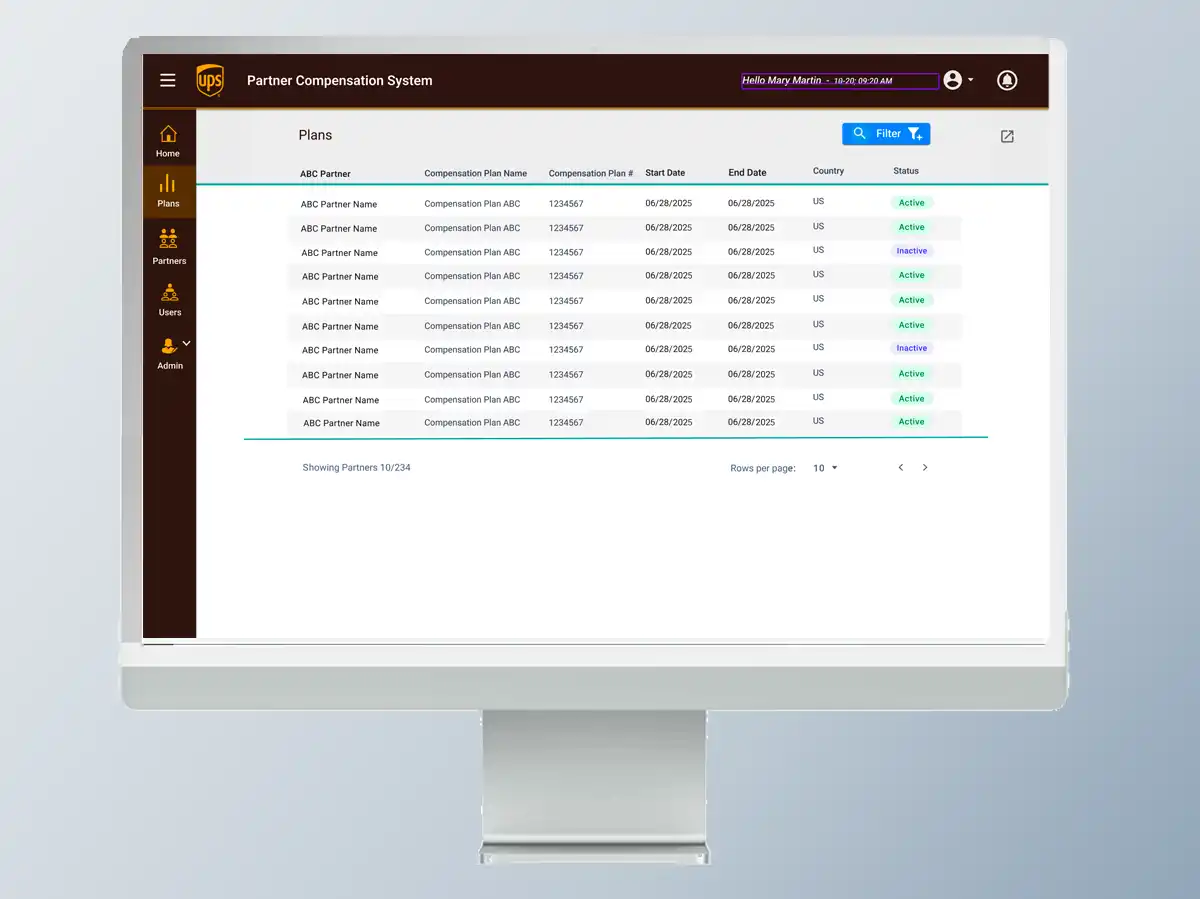
Scalable data views: The same design system handled a single consumer's rewards summary and a corporate account's breakdown of 200 team members — adapting layout and information density to the context rather than using separate interfaces.